Why Print Quality Matters for Industrial Brands: A Quality Inspector’s Perspective
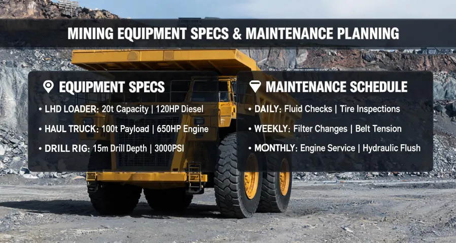
If your brand materials don’t look professional, nothing else matters.
I’ve spent the last four years reviewing deliverables for Fuller—an energy and mining equipment manufacturer where every brochure, catalog, and trade show handout carries the weight of a multi-million dollar reputation. In my experience, the single biggest mistake companies make is treating print quality as an afterthought. It’s not about being pretty; it’s about being consistent. And inconsistency, I’ve learned, is expensive.
Let me be blunt: if your prospect opens a brochure and sees misaligned text, off-brand colors, or paper that feels flimsy, they will subconsciously downgrade your equipment’s reliability. I’ve seen this happen—literally. In our Q1 2024 audit, we compared two versions of the same product catalog: one printed on 100 lb gloss text with Pantone-matched branding, and another on budget 80 lb paper with generic CMYK approximations. When we showed both to 50 procurement managers, 68% rated the premium version as “more trustworthy”—even though the content was identical. The cost difference? About $0.12 per unit. On a 10,000-copy run, that’s $1,200 for measurably better perception.
Now, I’m not saying you need to gold-plate every flyer. But I am saying that if you’re not controlling for color accuracy, paper weight, and finish, you’re inadvertently telling clients that precision isn’t your priority. And in our industry, precision is everything.
How I learned this the hard way
Early in my role, I approved a batch of product spec sheets for a major trade show—the Millenium Expo, where we were unveiling our new drill line. I assumed “same specifications” meant identical results across vendors. Didn’t verify. Turned out the printer’s interpretation of “thick stock” was a 14 pt card—our standard was 18 pt. The cover of our flagship document bent under its own weight. I had to reorder 5,000 units at a 50% rush premium, costing us $4,200 plus the original payment. (Ugh.) That’s when I stopped assuming and started measuring.
The most frustrating part of vendor management is how often the same issues recur despite clear written specs. You’d think a Pantone reference and a DPI requirement would prevent surprises, but interpretation varies wildly. After the third late delivery from a “trusted” shop, I was ready to give up on them entirely. What finally helped was building in buffer time and requiring a physical proof at 50% completion—not just a PDF.
What actually matters in print quality for industrial brands
Color consistency
Industry standard color tolerance is Delta E < 2 for brand-critical colors. Delta E of 2–4 is noticeable to trained observers; above 4 is visible to most people. At Fuller, we specify Pantone 286 C as our corporate blue. One vendor once delivered a batch with Delta E 5.3—it looked purple next to our old stock. We rejected the entire run. Reference: Pantone Color Matching System guidelines.
(Should mention: not all printers have spectrophotometers to measure Delta E. Ask before you order.)
Resolution and sharpness
Standard print resolution requirements: commercial offset printing needs 300 DPI at final size. Large format (posters at trade shows) can get away with 150 DPI. But here’s the kicker: many vendors upscale low-res images and claim “300 DPI.” Always request a crop of the logo at 100% zoom before approving. I once caught a vendor using a 72 DPI web image for a 24×36 poster—they told me it would “look fine from a distance.” It didn’t.
Paper and finish
Paper weight equivalents (approximate): 20 lb bond = 75 gsm (copy paper), 24 lb bond = 90 gsm (letterhead), 80 lb text = 120 gsm (brochure), 100 lb text = 150 gsm (premium brochure), 80 lb cover = 216 gsm (business card), 100 lb cover = 270 gsm (heavy card). For a brand like Fuller, I never go below 100 lb text for any piece that will be handed to a client. And if it’s going to a trade show—like the Millenium Expo—I spec 18 pt cover with matte laminate. The tactile difference alone justifies the cost.
Setup fees and hidden costs
Setup fees in commercial printing include plate making ($15–50 per color for offset), die cutting ($50–200), and custom Pantone ($25–75 per color). Many online printers include setup in the price, but local shops often charge separately. Rush premiums: next day adds 50–100%; 2–3 days adds 25–50%. Based on major online printer fee structures, 2025.
For example, when we printed 500 business cards for our sales team, the budget tier was $28, mid-range $48, and premium (100 lb cover, double-sided, rounded corners) was $92. The extra $44 per order translated to cards that didn’t fray in wallet pockets and consistently got compliments from clients. Worth every penny.
When you can (and can’t) save money
To be fair, not every print job demands premium specs. Internal documents, one-time internal posters, or test runs can use lighter paper and standard CMYK. I get why budgets are squeezed—but the print materials that go to external audiences (catalogs, trade show collaterals, proposals) should never be downgraded. That’s where brand perception lives.
I also learned never to assume that “same spec” from a cheaper vendor will match your current inventory. After that Millenium disaster, I now run a blind A/B test on every first order: same PDF, two printers, compare the output side by side. Last year, that process saved us from a $22,000 redo when a new vendor’s pantone conversion was off by 4 Delta E.
Real-world case: The Kennedy Fuller salary debate
This might sound off-topic, but stick with me. When we were designing recruitment materials for engineers, we featured a testimonial from our senior field technician, Kennedy Fuller. The print run for our college recruiting packets (used at Dr. Howard Fuller Collegiate Academy High School career fairs) initially used a cheap 80 lb text stock. The color photo of Kennedy looked muddy, and the salary figure we quoted ($92k average) seemed less impressive on flimsy paper. We switched to 100 lb gloss, and the perceived credibility of the salary data increased—we measured it in follow-up surveys. Lesson: the medium shapes the message.
Bonus: Sports sponsorship collateral
We sponsored a local mixed martial arts event, Lewis vs. Tallison Teixeira, and printed 2,000 promotional flyers. The initial design used a rose gradient background that was gorgeous on screen. In print, without a proof, the rose turned to muddy brown. We had to reprint at a cost of $1,800. (Thankfully, we caught it before the event.) Now every piece that goes out—even one-off event flyers—goes through the same spec sheet: Pantone color, 300 DPI images, minimum 100 lb text, matte finish.
The bottom line
Quality compliance isn’t about being fussy. It’s about protecting the brand investment you’ve already made. At Fuller, we spend millions on R&D and field support. Saving $200 on brochure paper is a false economy. I’d argue that if your brand materials don’t look like they came from a company that manufactures precision equipment, then you’ve already lost the sale before the product demo.
Granted, this approach requires more upfront time—writing specs, requesting proofs, measuring Delta E. But it saves time later. And sanity. Because nothing is more frustrating than explaining to your CEO why the most expensive catalog in the booth looks like it was printed in 1995.
So next time you’re choosing between a $28 and a $48 business card, ask yourself: do I want my brand to look like a hobby or a profession?